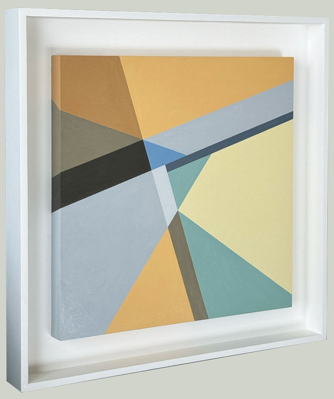
I want to tell you about my thoughts feelings experiences as I paint this line, one of millions of lines I’ve painted over the last 45 years. This line is NOT in fact a line at all. It is the mutual edge of two abutting shapes. The relationship of those two shapes to each other and to the other shapes in the painting is the subject of this body of work.
I see these shapes as individuals in a community. I also see them as notes of music in a melody. In either case, each shape must be independent of the other. In March 1992, the Radcliffe Quarterly published my cover story article, “Contrapuntal Painting: art as visual conversation.” Counterpoint is a musical composition revolutionized by Johannes Sebastian Bach in which the two or more melodies playing simultaneously are both independent melodies and auxiliary harmonies to the others. Edward Rothstein, whom I quote in this article, asserts that Bach depicts a new kind of interaction among the notes, and by extension human beings. “The fugue establishes a community of like minds and distinct parts, very different from the polyphony of the Renaissance, where the focus is less on individual voices than on the overall texture." I then wrote, “I am painting a community of minds as I see them in the late 20th century with a unique potential for individuality and interdependence.”
I extended this metaphor, or symbolism – or what is it exactly? – specifically to the relationship of men and women. I invoke Matisse who said, and I paraphrase, “the art of painting begins when the painter sees the vase and the space around the vase simultaneously.”
But what is a vase in a painting? What is a shape? One cannot have negative and positive space unless both are equally strong. I begin the painting with a graphite line drawing. How do I know when the shapes created by these lines are strong enough to hold their own? Once I start painting, when do I know a shape has broken away from the adjacent shape, when it has its own physical integrity? Why did I invent this game to begin with??
Again Matisse. In 1973, Flora Natapoff, my first and most important painting teacher, brought us from Carpenter Center to the Fogg to look at black and white Matisse ink line drawings. She wanted us to see how lines create shapes that start to read color. My drawing is ready for paint when the shapes start to read color. Color and shape create an illusionary third dimension in a painting. Critic Clement Greenberg called this optical illusion. He called perspective, another visual feature that creates an illusionary third dimension, sculptural illusion. All paintings must wrangle with optical illusion; only some with sculptural illusion.
In my experience, painting begins with constant awareness of this third dimension. Reds push forward, blues push back. The shapes read in space by the illusion of one in front of the other. Most simply, I push the forward shapes back with blues, and receding shapes forward with reds. They must always move the eye around the painting. Paul Klee called this “dynamic symmetry.” Hans Hoffman developed the term “push pull” in his long, distinguished career as a teacher and painter.
I invoke Hans Hoffman in one of my “Secrets” graphite text drawings of 2000-2001. This suite focuses on Henry James’ Wings of the Dove. In this drawing, I quote from James’ preface:
The enjoyment of a work of art, the acceptance of an irresistible illusion, constituting to my sense, our highest experience of luxury…. It is greatest, it is delightfully, divinely great when we feel the surface like the thick ice of the skater’s pond, bear without cracking the strongest pressure we throw on it.”
I wrote in the same drawing:
The illusion resists every pressure. Nothing pops out of the canvas that another element does not push back, nothing recedes without being pulled back to the surface. Hans Hoffman’s push/pull the basis of the painter’s illusionary space.
In 1975 I received a scholarship to study at the Provincetown Workshop, the heir of Hans Hoffman’s legendary school in Provincetown.
Shape and color. Am I any closer to describing how one knows – for oneself – when a shape starts to read color? I will replay an earlier clip in which I am saying to my friend Stephanie, who is filming, “The thing is, that’s why it’s called The More You Look The More You See. Because as I look at this line I see more – I see IT - more clearly.” IT must be the line, but when I listen to myself, I’m not sure what IT actually is. The more I look the more I see. I know when a work is complete when all of a sudden, this community of shapes touches my heart. Then it starts to respond and to give.
In my mind, the paintings’ contiguous shapes have both a moral and an aesthetic dimension. A fundamental principle of Jewish thought is making distinctions. For example, holy, kadosh, literally means something separated. Thou shalt, thou shalt not. No gray areas there. One must draw the line somewhere. I have called this body of work Intimate Geometry. The graphite lines are drawn with a straight edge. The painted boundary by eye. I’m always looking at the vase and the space around it. That is part of my job, which does not cease to give me pleasure. The line isn’t perfectly straight if you were to look at with magnification. Yet, in the paintings that work, it does its job of freeing one shape from the other.
